
Skills
typography principles
publication design
layout design
InDesign
Role
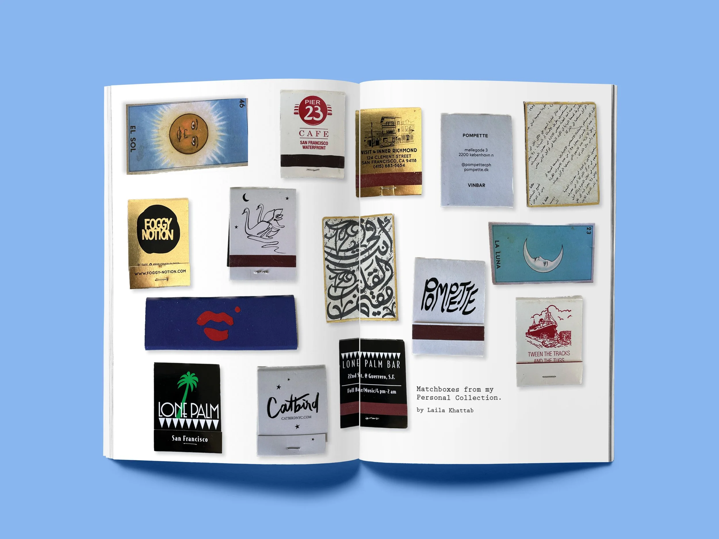
I took Typography my senior year of college at the University of San Francisco. We covered the history of Western type, anatomies of text, publication design, and custom lettering.
Results
Through research and case studies, I’ve gained a deep understanding of Western typographic practices and history. I’ve experimented and grown in my type skills through projects and their design critiques.
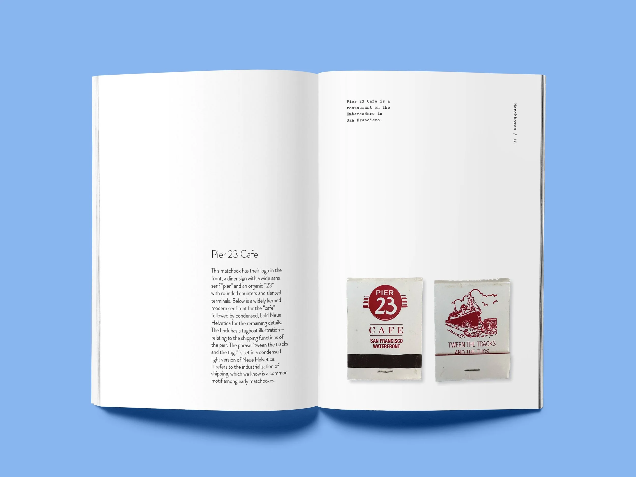
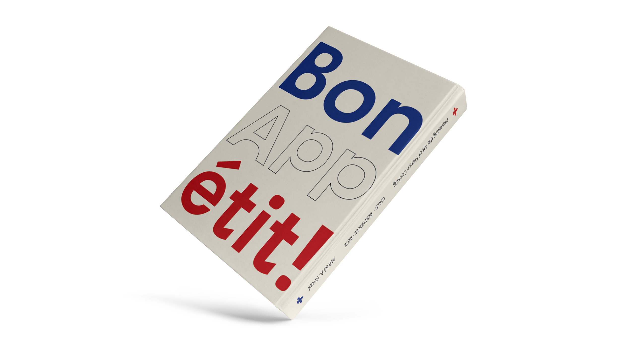
Publication Design: Found Type
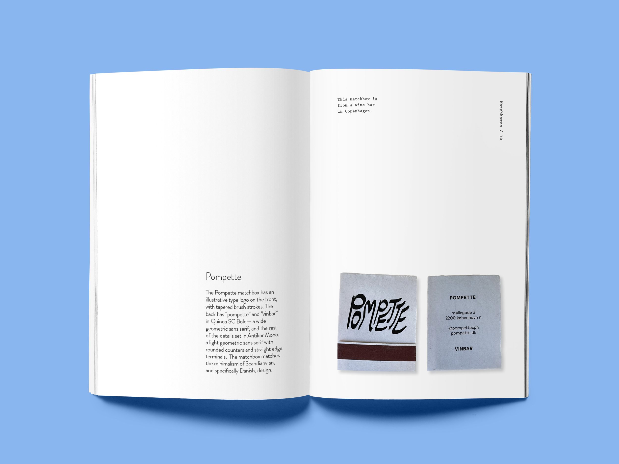
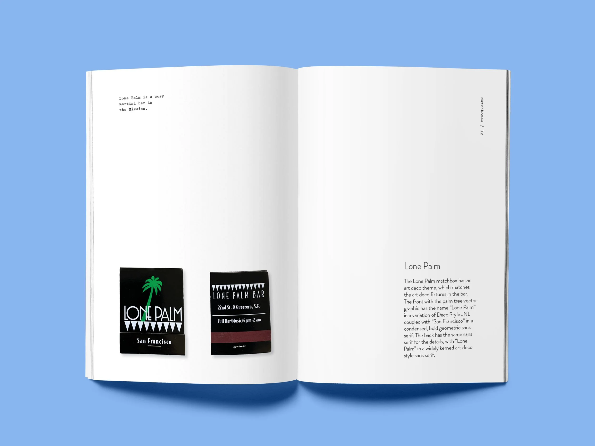
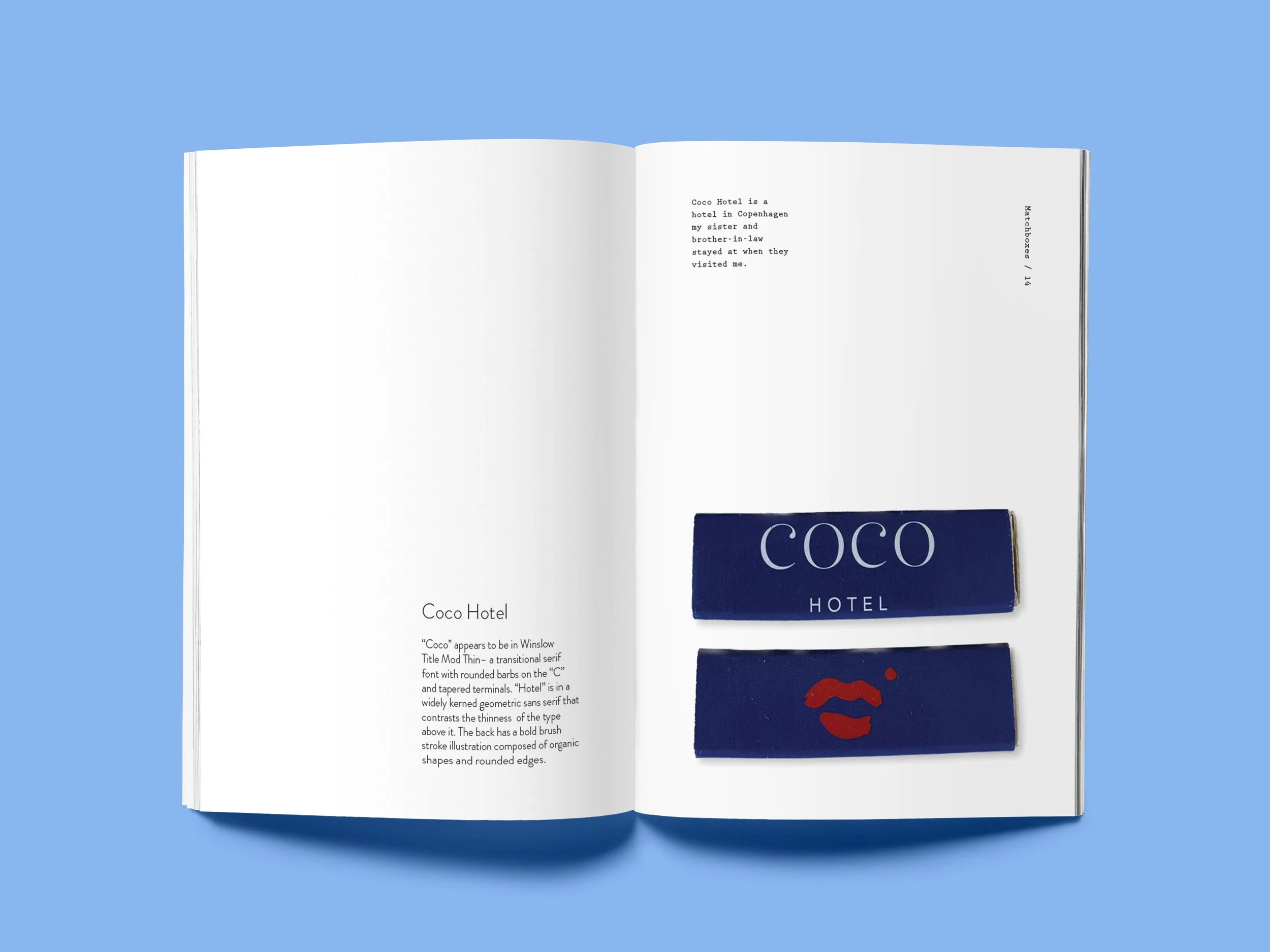
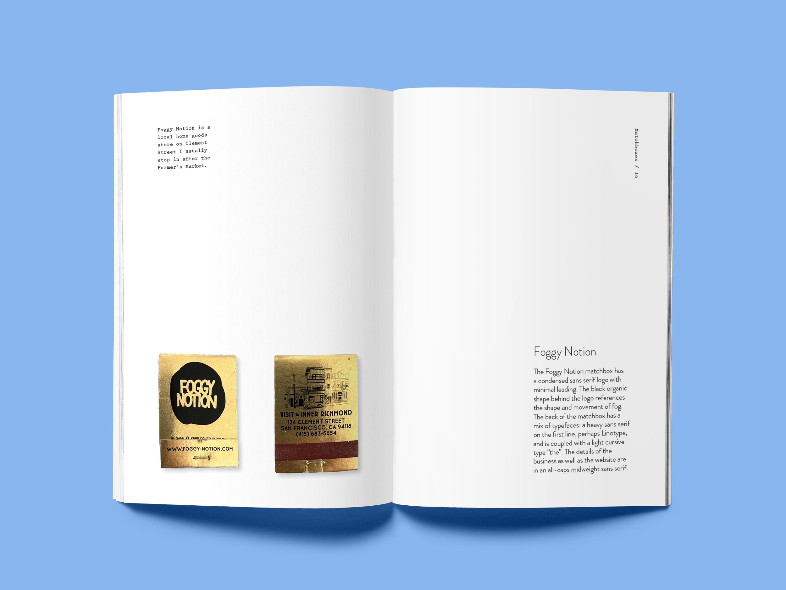
Project focused on hierarchy, grids, pacing, & copy.

Type Compositions
Project focused designing within strict parameters for different environments given specific copy, just as clients request designs for existing materials.
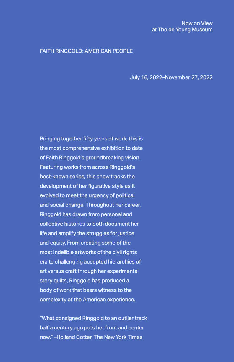
Exhibition Advertisement: Only use Aktiv Grotesk Regular or Regular Italic, 36/60. Only use placement and alignment (1 size, 1 weight) to denote hierarchy.
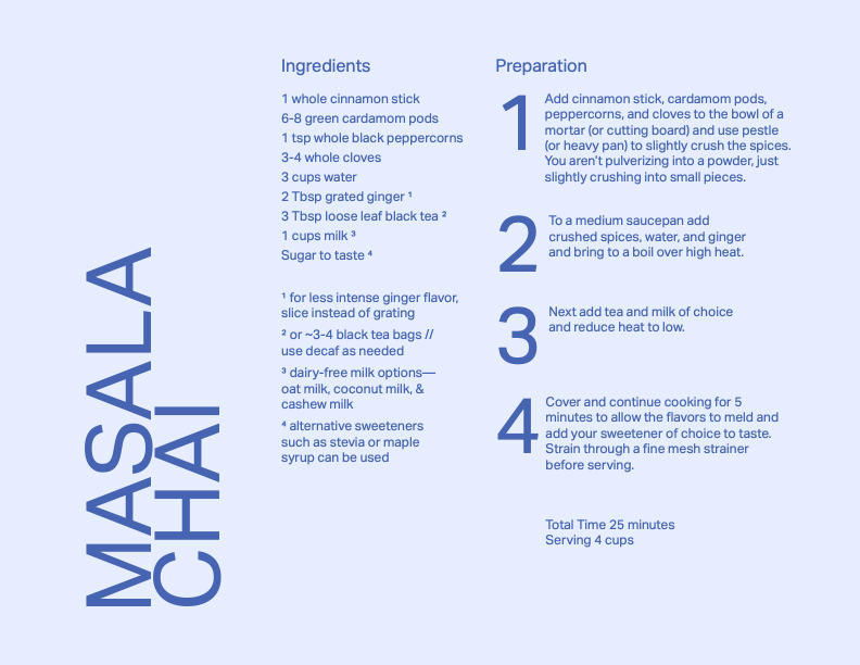
Recipe: Only use Aktiv Grotesk Regular or Regular Italic. Use placement, alignment, leading and type size to denote hierarchy.
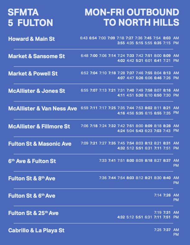
Bus Schedule: Use the Aktiv Grotesk family. Use placement, alignment, weight / style, leading, and type size to denote hierarchy.
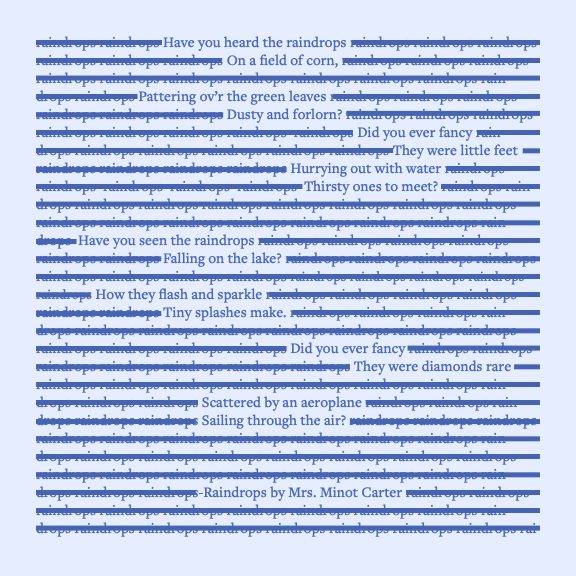
Poem: Only use the Adobe Garamond family. Use placement, alignment, weight / style, leading, type-size, and kerning and tracking to denote hierarchy.
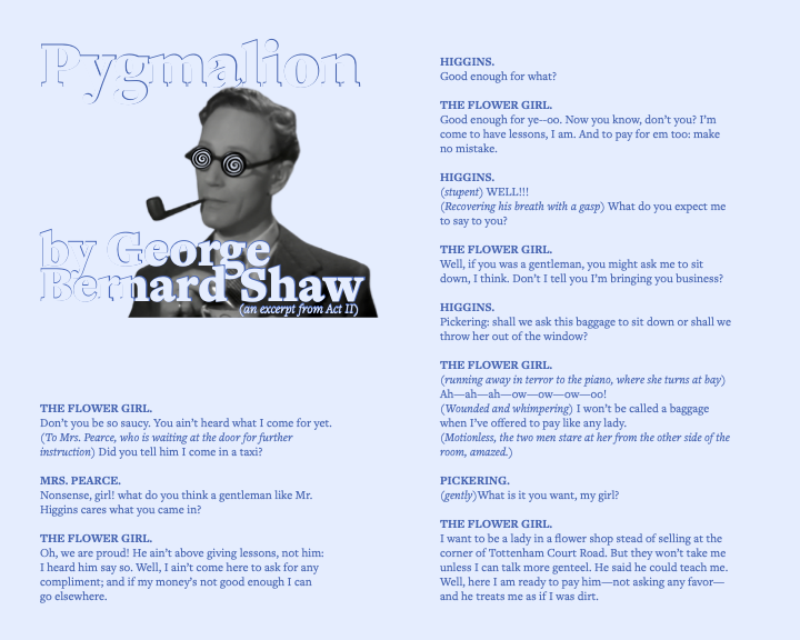
Dialogue: Use the Adobe Garamond family and the Aktiv Grotesk type family. Use placement, alignment, weight / style, leading, type-size, and kerning and tracking to denote hierarchy. Use image(s) in some of your studies.
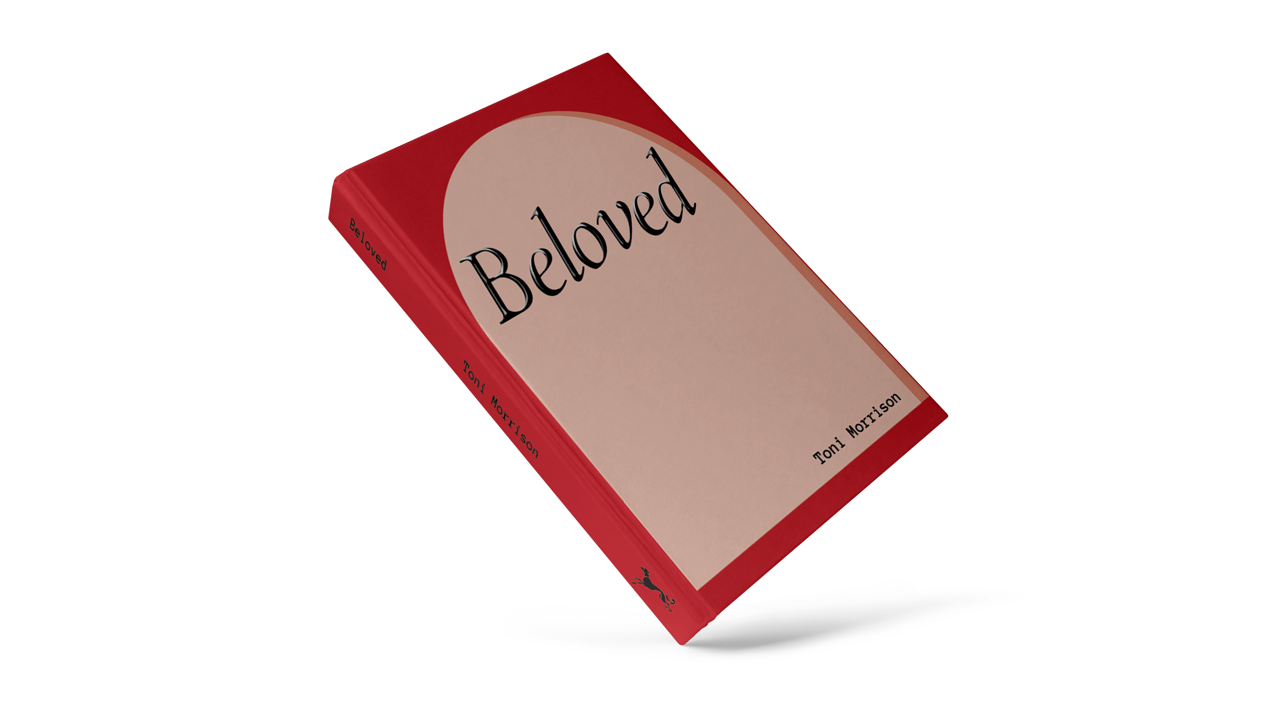
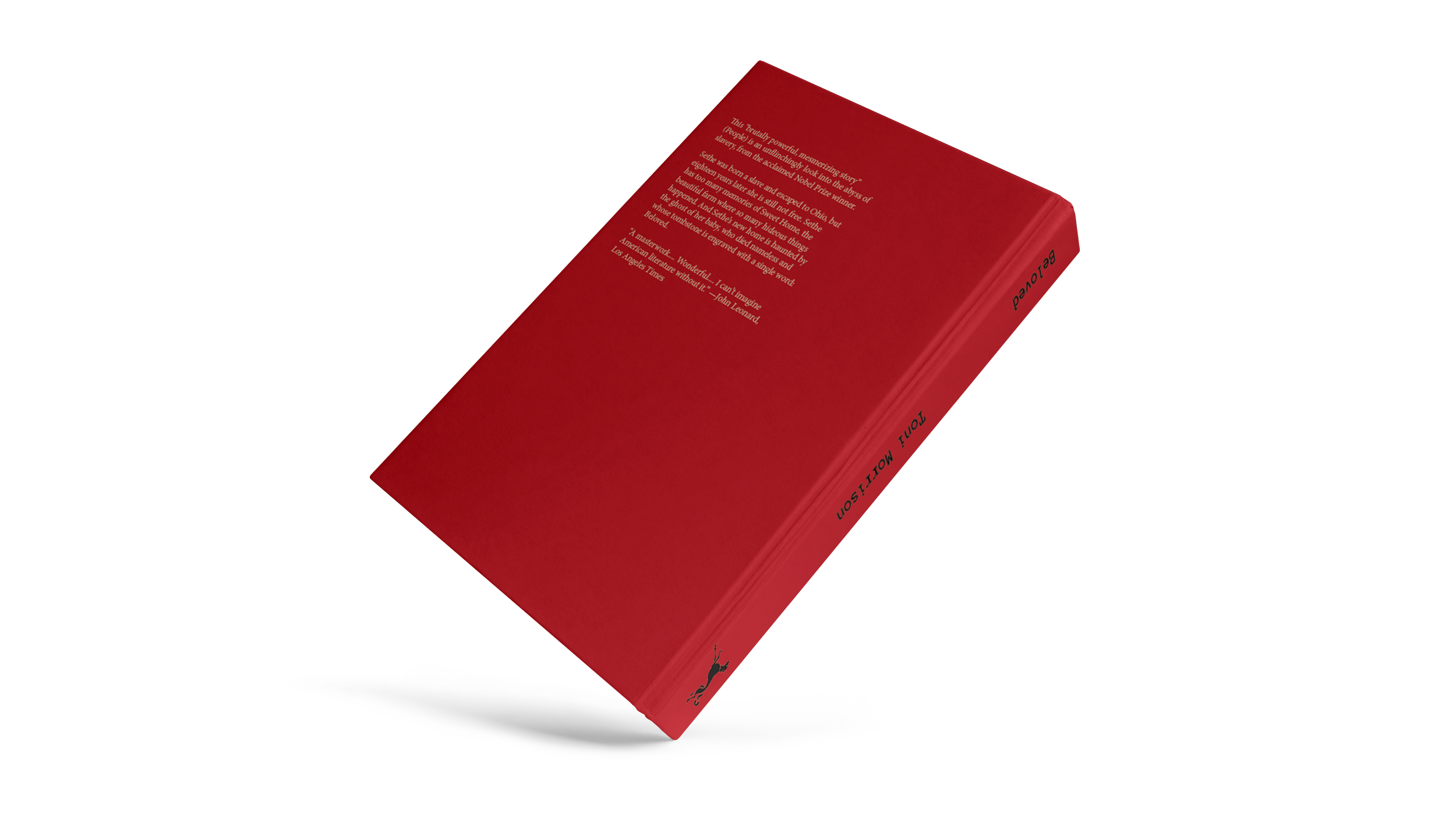
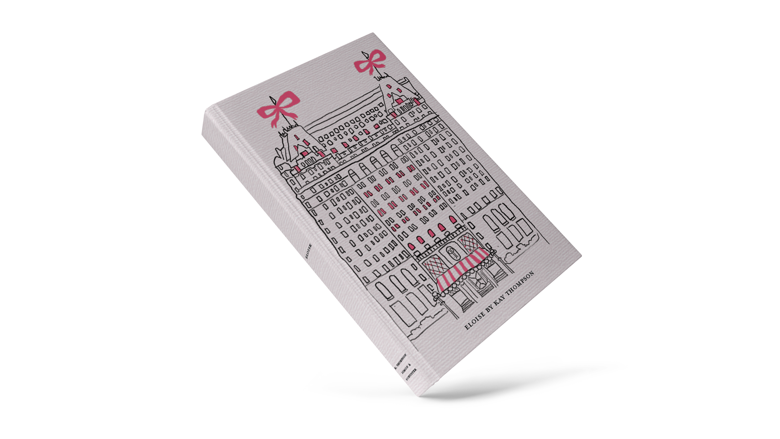
Book (Re)Designs


Zine Design


